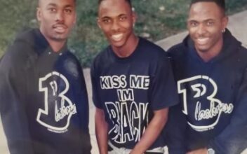
Preceding No Grease!, the twin brothers, Damian and Jermaine’s earlier venture into logo design was for
the Blackness T-shirt brand. A brand that aimed to express the essence of black culture particularly
significant given the context of the early 1990s, a time when discussions about race and identity were
becoming increasingly prominent in popular culture. By using design as a tool for social commentary and
empowerment, they demonstrated a keen awareness of the power of imagery and branding to shape
perceptions and provoke thought.
The concept of the brand speaks to a profound understanding of the complexities of black identity and
the historical struggles faced by all Americans of color. By emphasizing mindset over physical
appearance, the brothers sought to challenge stereotypes and highlight the resilience, creativity, and
diversity within black culture, laying the foundation for the impactful work that would follow with No
Grease! Barbershop.
Their creative vision for the No Grease! logo, drawing from both the historical context of the minstrel
show/black face and hip hop/graffiti culture, speaks to the complexity and richness of their artistic
influences.
The blend of these often-confrontational influences in the logo reflects the fusion of cultures and styles
that define No Grease! Barbershop, making it not just a place for haircuts, but a cultural hub and a
symbol of empowerment for the community.
The fact that No Grease! became the first black-owned barbershop franchise adds another layer of
significance to its story, highlighting their ability to overcome challenges and break barriers within the
broader business world. Their journey is a testament to the power of creativity, determination, and
community support in achieving success and making a positive impact.